13. Line Plots
L4 131 Line Plots V1
Data Vis L4 C13 V1
Line Plots
The line plot is a fairly common plot type that is used to plot the trend of one numeric variable against values of a second variable. In contrast to a scatterplot, where all data points are plotted, in a line plot, only one point is plotted for every unique x-value or bin of x-values (like a histogram). If there are multiple observations in an x-bin, then the y-value of the point plotted in the line plot will be a summary statistic (like mean or median) of the data in the bin. The plotted points are connected with a line that emphasizes the sequential or connected nature of the x-values.
If the x-variable represents time, then a line plot of the data is frequently known as a
time series
plot. Often, we have only one observation per time period, like in stock or currency charts. While there is a seaborn function
tsplot
that is intended to be used with time series data, it is fairly specialized and (as of this writing's seaborn 0.8) is slated for major changes.
Instead, we will make use of Matplotlib's
errorbar
function, performing some processing on the data in order to get it into its necessary form.
plt.errorbar(data = df, x = 'num_var1', y = 'num_var2')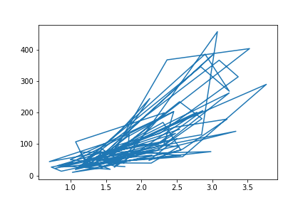
If we just blindly stick a dataframe into the function without considering its structure, we might end up with a mess like the above. The function just plots all the data points as a line, connecting values from the first row of the dataframe to the last row. In order to create the line plot as intended, we need to do additional work to summarize the data.
# set bin edges, compute centers
bin_size = 0.25
xbin_edges = np.arange(0.5, df['num_var1'].max()+bin_size, bin_size)
xbin_centers = (xbin_edges + bin_size/2)[:-1]

# compute statistics in each bin
data_xbins = pd.cut(df['num_var1'], xbin_edges, right = False, include_lowest = True)
y_means = df['num_var2'].groupby(data_xbins).mean()
y_sems = df['num_var2'].groupby(data_xbins).sem()

# plot the summarized data
plt.errorbar(x = xbin_centers, y = y_means, yerr = y_sems)
plt.xlabel('num_var1')
plt.ylabel('num_var2')
Since the x-variable ('num_var1') is continuous, we first set a number of bins into which the data will be grouped. In addition to the usual edges, the center of each bin is also computed for later plotting. For the points in each bin, we compute the mean and standard error of the mean. Note that the
cut
function call is simpler here than in the previous page, since we don't need to compute individual point weights.
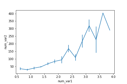
An interesting part of the above summarization of the data is that the uncertainty in the mean generally increases with increasing x-values. But for the largest two points, there are no error bars. Looking at the default
errorbar
plot (or the scatterplot below), we can see this is due to there only being one point in each of the last two bins.
Alternate Variations
Instead of computing summary statistics on fixed bins, you can also make computations on a rolling window through use of pandas'
rolling
method. Since the rolling window will make computations on sequential rows of the dataframe, we should use
sort_values
to put the x-values in ascending order first.
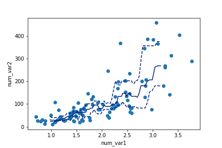
# compute statistics in a rolling window
df_window = df.sort_values('num_var1').rolling(15)
x_winmean = df_window.mean()['num_var1']
y_median = df_window.median()['num_var2']
y_q1 = df_window.quantile(.25)['num_var2']
y_q3 = df_window.quantile(.75)['num_var2']

# plot the summarized data
base_color = sb.color_palette()[0]
line_color = sb.color_palette('dark')[0]
plt.scatter(data = df, x = 'num_var1', y = 'num_var2')
plt.errorbar(x = x_winmean, y = y_median, c = line_color)
plt.errorbar(x = x_winmean, y = y_q1, c = line_color, linestyle = '--')
plt.errorbar(x = x_winmean, y = y_q3, c = line_color, linestyle = '--')

plt.xlabel('num_var1')
plt.ylabel('num_var2')
Note that we're also not limited to just one line when plotting. When multiple Matplotlib functions are called one after the other, all of them will be plotted on the same axes. Instead of plotting the mean and error bars, we will plot the three central quartiles, laid on top of the scatterplot.
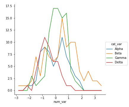
Another bivariate application of line plots is to plot the distribution of a numeric variable for different levels of a categorical variable. This is another alternative to using violin plots, box plots, and faceted histograms. With the line plot, one line is plotted for each category level, like overlapping the histograms on top of one another. This can be accomplished through multiple
errorbar
calls using the methods above, or by performing multiple
hist
calls, setting the "histtype = step" parameter so that the bars are depicted as unfilled lines.
bin_edges = np.arange(-3, df['num_var'].max()+1/3, 1/3)
g = sb.FacetGrid(data = df, hue = 'cat_var', size = 5)
g.map(plt.hist, "num_var", bins = bin_edges, histtype = 'step')
g.add_legend()
Note that I'm performing the multiple
hist
calls through the use of
FacetGrid
, setting the categorical variable on the "hue" parameter rather than the "col" parameter. You'll see more of this parameter of FacetGrid in the next lesson. I've also added an
add_legend
method call so that we can identify which level is associated with each curve.
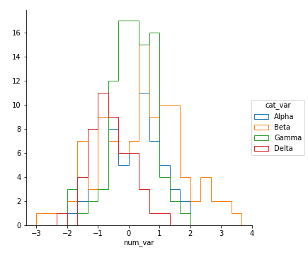
Unfortunately, the "Alpha" curve seems to be pretty lost behind the other three curves since the relatively low number of counts is causing a lot of overlap. Perhaps connecting the centers of the bars with a line, like what was seen in the first
errorbar
example, would be better.
Functions you provide to the
map
method of FacetGrid objects do not need to be built-ins. Below, I've written a function to perform the summarization operations seen above to plot an
errorbar
line for each level of the categorical variable, then fed that function (
freq_poly
) to
map
.
def freq_poly(x, bins = 10, **kwargs):
    """ Custom frequency polygon / line plot code. """
    # set bin edges if none or int specified
    if type(bins) == int:
        bins = np.linspace(x.min(), x.max(), bins+1)
    bin_centers = (bin_edges[1:] + bin_edges[:-1]) / 2

    # compute counts
    data_bins = pd.cut(x, bins, right = False,
                       include_lowest = True)
    counts = x.groupby(data_bins).count()

    # create plot
    plt.errorbar(x = bin_centers, y = counts, **kwargs)

bin_edges = np.arange(-3, df['num_var'].max()+1/3, 1/3)
g = sb.FacetGrid(data = df, hue = 'cat_var', size = 5)
g.map(freq_poly, "num_var", bins = bin_edges)
g.add_legend()
**kwargs
is used to allow additional keyword arguments to be set for the
errorbar
function.
(Documentation:
numpy
linspace
)